03 / 07 · Case study
Trust & Value
Role
UX Research Intern
Discipline
- Strategy
Context
Fintech
Year
2025
Two kinds of user needed two different reasons to trust Super+. I proposed building both onboarding flows instead of tuning one, and stated sign-up intent rose 50%.
I led the usability research on Super.com's onboarding redesign over 4 months, not the designs or the roadmap: product design built each iteration, and product management decided what shipped.
Why it mattered
One premium membership bundled hotel discounts and credit-building, and one generic onboarding tried to sell both
What I did
Tested travel-motivated and credit-motivated users separately, at both component and end-to-end scope
The call I made
Proposed building two full onboarding flows instead of tuning one, after watching the segments diverge round after round
What changed
Stated sign-up intent rose 50% and referral likelihood 58% against the original flow: self-reported, not funnel data
One flow, two very different reasons to care
Super.com bundles hotel discounts, credit-building, and gamified earning under one premium membership, Super+. That's exactly the problem.
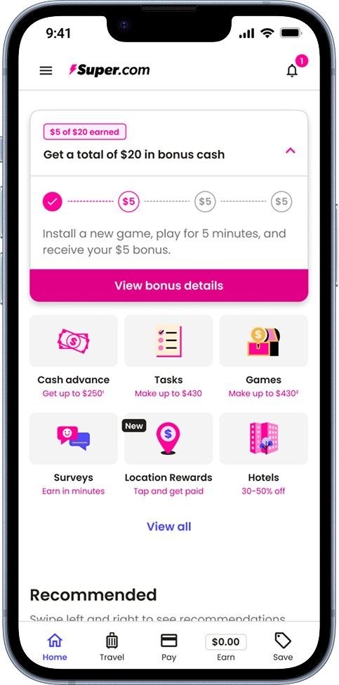
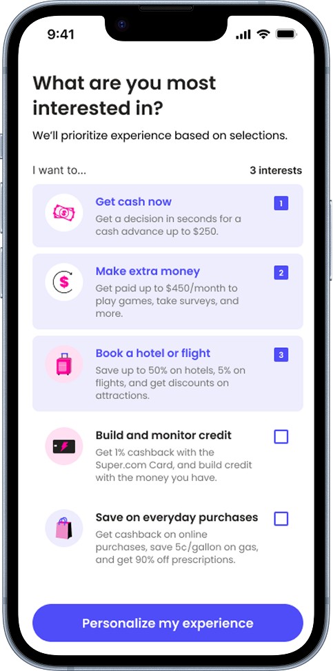
A user chasing cheaper hotels and a user trying to build credit are motivated by completely different value, yet the existing onboarding tried to sell both with the same generic flow. With a major app redesign underway, I was brought in to lead usability research on the new onboarding, working with product design and product management over 4 months to make sure it built trust and made Super+'s value obvious for either kind of user.
Testing by motivation, not by feature
A single usability test wasn't going to answer this, because "does this work" depends entirely on who's asking.
I split participants into segments by their actual motivation, travel-focused vs. credit-building-focused, so I could measure how well onboarding landed for each group rather than averaging away the difference between them. I also varied scope deliberately: component-level tests isolated individual steps so the team could act on specific fixes fast, while end-to-end tests checked whether the full journey still held together and built trust across the whole flow.
The recruiting strategy evolved too. Early rounds used 6 participants per segment, enough for fast, directional feedback while designs were still moving. Once we'd iterated, I expanded follow-up rounds to 10 per segment, because a decision this close to launch needed numbers I could actually trust.
Segmentation was the whole answer
The earliest rounds already made the case before I'd finished the study.
Testing travel-focused and credit-building-focused users side by side showed how differently they actually prioritized the same app: their jobs-to-be-done barely overlapped.
Travel-focused users came to make a booking and save money on it. Credit-building users came to earn through tasks and raise their credit score with the Super.com card. Same app, same onboarding, and almost nothing in common between what each one needed to see first.
I kept design and product in the loop as that became clear, rather than saving it for a single reveal at the end. A preliminary results memo after early rounds shared the actionable feedback while it was still fresh, followed by a more formal writeup once a full round wrapped, with the complete results and what they meant.
Post-redesign testing confirmed the segmented approach was worth the extra build: a 50% increase in users' stated willingness to sign up, and a 58% increase in referral likelihood, compared to the original flow. Both are self-reported measures from 10 participants per segment, not funnel data.
Proposing two flows instead of one
The ask landed as the obvious next step rather than a leap, because product and design had already watched the two segments diverge round after round.
Scope call
Build two full onboarding flows instead of tuning one, and absorb the extra build cost.
It was a real scope increase, and I was the one who asked for it. Keeping design and product close to the rounds is what made that possible: the case for two flows was built out of sessions they had already sat through, rather than argued from a deck at the end.
I left before launch, so I can't say how much of the segmented onboarding shipped as tested. What I can account for is the decision itself, and the rounds of evidence that made it an easy one to accept.
When the scores fell on a better design
In a few early rounds, the quantitative scores actually regressed for designs the team agreed were clear improvements.
The PM and designer both pushed back hard on that, understandably: if the design was better, why did the number say otherwise?
Rather than defending the mean, I showed them the spread behind it. At 6 participants per segment, one person having a rough session could swing the whole average, and that's exactly what was happening. From there I leaned on the qualitative side, quotes and observed behavior from the same sessions, to judge whether a change had actually landed, instead of taking a noisy small-sample score at face value.
In formative research, the qualitative data is the true signal. A small sample's scores are a clue, not a benchmark.
The real fix wasn't a chart, it was cadence: a conversation with the PM and designer after every round, not just a report dropped in their inbox. Talking through the results together, live, meant I could flag exactly where a number was likely misleading before anyone made a call based on it. That's what kept a good design from getting killed over statistical noise, and part of why I pushed to expand the later validation rounds to 10 participants per segment before reporting the lift as a real result.
What I'd do differently
Two things here I'd change next time.
I'd start looking past the average score from round one, not just once a good design already looked like it had failed. A single rough session in a 6-person group can drag the average down even when most participants had a fine experience, and checking the range of scores plus the actual participant quotes catches that early instead of after the fact.
I'd also reconsider starting with 10 participants per segment instead of 6. Six was faster early on, but untangling the misleading scores it produced ended up costing more time than just running the larger sample from the start would have.