04 / 07 · Case study
New Shoppers
Role
UX Research Intern
Discipline
- Strategy
Context
Fintech
Year
2024
Checkout went first.
Speed beat features. Reordering checkout ahead of account creation took account creation from 3 of 10 test participants to 10 of 10.
I owned the research across three phases at Interac over 4 months, not the redesign itself: UX design built each iteration, and reordering the flow was a joint call with design and product.
Why it mattered
KONEK was launching into a crowded payments market as an unproven beta, and onboarding was where sign-ups get lost
What I did
A three-researcher PURE evaluation, then an unmoderated A/B test with 20 shoppers, then competitive interviews
The call I made
Account creation was never mandatory, which is what let us put checkout first and pitch signing up along the way
What changed
Account creation went from 3 of 10 participants to 10 of 10, and the partner banks were happy with the results
Beta trust in a crowded market
KONEK was entering a crowded payments market as a beta product, still unproven to the people it needed to convert.
Onboarding was the single highest-leverage point in the funnel: any friction, confusion, or trust gap there would cost sign-ups before the product ever got a chance to prove itself. Over 4 months, working with UX design, product, and marketing at Interac, on a public partnership between Interac and several of Canada's major banks, I owned the research that turned onboarding from a launch risk into a conversion driver.
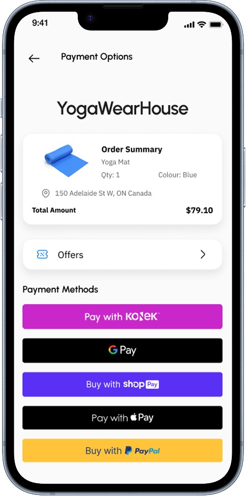
Three phases, each earning the next
I didn't want to wait for a full usability study to catch the obvious problems, so I started fast and cheap: a PURE heuristic evaluation.
Scored through the lens of a proto-persona built from market data, it flagged high-cognitive-load steps before a single user was ever in the room. Three researchers ran the evaluation, so the score wasn't one evaluator's read. Because PURE assigns a numeric score, it also let me benchmark KONEK's checkout against the competitors it actually had to beat: a score of 29 against PayPal's 5 and Shop Pay's 7, across nearly triple the total steps.
Part of that gap was structural, not a design flaw: KONEK's checkout hands off to the shopper's own bank mid-flow, a step none of its card-based competitors need.
Once design acted on the findings that were actually fixable, I raised the bar. A second PURE pass on the redesigned flow (V1.1), scored by the same three researchers, confirmed real progress: the score dropped from 29 to 19, entirely from tightening the review-and-payment screens, which fell from 15 to 5. Sign-up and the bank hand-off held steady at 7 each, since neither sits fully inside KONEK's own UI.
Expert review alone doesn't prove real users will get through it, so I ran an unmoderated A/B test, recruiting 20 Canadian shoppers who already used PayPal through UserTesting, split 10-and-10 between the original and redesigned flow. Unmoderated was the right call specifically because the core task, online checkout, is one users already know. I needed unfiltered behavior, not a moderator's guidance.
The last phase raised the bar again: after the usability study, "usable" wasn't the goal, "competitive" was. I ran moderated interviews with 8 existing PayPal and Shop Pay users, to learn what they actually prioritized in a payment flow and how KONEK's redesign stacked up against the experience they were already loyal to.
Two sets of stakeholders, kept in the loop
None of these three phases ran in isolation from the people who had to act on them.
I worked closely with design and product throughout each test, sharing results as live shareouts alongside the written documents, and ran co-designing sessions where we'd brainstorm directly against whatever issue the latest round had surfaced, instead of just handing over findings and waiting.
The banks in the partnership had their own stake in the outcome, and their own timeline to answer to. Rather than waiting for the full three-phase story to wrap, I hosted update sessions with design any time we'd landed a meaningful improvement, which kept them confident the work was on track and gave them a chance to weigh in before the direction was locked in. We took the final results and the latest design back to them at the end, and they were happy with both. Development continued after I left.
The reorder that followed from it
The clearest signal across all three phases: new users cared about speed more than anything else.
Not more features, not more upfront profile-building. Just a fast path to their first transaction.
New users prioritized speed over features, so we rebuilt the flow around getting there faster.
Decision
Reorder the flow: checkout first, profile creation after, once we found that account creation was never mandatory.
It read as a bigger swing than it actually was. Account creation had never been required to use KONEK in the first place, which meant shoppers could get through a fast checkout first, and we could make the case for signing up along the way instead of gating it upfront.
Not every piece of that reorder was mine to negotiate alone. We'd wanted to bundle every terms-and-conditions acknowledgment into a single action to cut a step from the flow, but legal held firm that certain disclosures needed to stay their own discrete step. The compromise we landed on let users advance through the terms without being forced to scroll through the full document first, cutting the friction without losing the separate acknowledgments legal needed to keep. Trust signals, clearer legal copy, and lightweight tooltips filled in the rest, building confidence along the way rather than upfront.
The dip between "authorized payment" and "completed checkout" had one recurring cause in both versions: participants often missed the final "Place order" button back on the merchant's page, mistaking KONEK's own confirmation screen for the end of the flow. "I felt like the payment was completed before, I did two tabs at the end, but I felt like the last tab wasn't necessary," one participant said. The fix wasn't a KONEK screen at all: it was rewriting the hand-off copy to tell users they still needed to place the order on the merchant's page.
Account creation told a cleaner story. Where V1's holdouts wanted to "just pay for it and get it over with," V1.1's participants had a different read entirely.
“So, I do think in a real situation if I do see this option coming up more frequently, I would probably just keep the information.”
Front-loading checkout meant account creation never felt like it was standing in the way of the transaction.
The redesigned flow took account creation from 3 of 10 participants to 10 of 10, and it held up even though every participant walked in already loyal to a competitor.
Why KONEK still scored behind PayPal
The PURE score told a more complicated story than the usability numbers did.
Even after the redesign, KONEK's 19 still trailed PayPal's 5 and Shop Pay's 7, for three reasons that had nothing to do with how well the interface itself was built:
- –Payment liability sits with the bank, not KONEK. A financial institution assuming liability for the transaction needs more robust authentication than a stored card number, which structurally adds steps a card-based competitor doesn't carry.
- –The comparison wasn't like-for-like. PayPal and Shop Pay's 5 and 7 reflect a returning shopper whose browser autofills the form, something a KONEK beta user had no equivalent of. Re-running the PURE evaluation on both flows without autofill put them at 10 and 12.
- –A new privacy policy step, added to V1.1 on legal's direction, wasn't part of V1's score at all: a step that improved compliance but counted against usability.
None of those are fixable through interface design alone, which is exactly why the usability numbers, not the heuristic score, were the real evidence that the redesign worked.
That distinction mattered for how I framed the score internally, too. A higher PURE number wasn't a sign the team had underdelivered: it was the direct, structural cost of pairing to a shopper's own bank, the same mechanism that gave KONEK a safer and ultimately faster checkout than a stored card number could offer. The same logic pointed outward as well as inward: if a longer setup was the price of that tradeoff, shoppers needed to hear what they were getting in return for it, not just stakeholders.
What I'd do differently
Two things here I'd change next time.
Legal's pushback on bundling the terms-and-conditions steps came after the redesign was already proposed, which meant renegotiating a decision instead of scoping around it from the start. I'd loop legal into the research-scoping phase itself next time, not just the design review, so a constraint like that shapes the plan going in rather than getting negotiated after the fact.
I'd also want a larger sample behind the account-creation result. It held up statistically at 10-and-10, but a number carrying this much weight in how I talk about the project deserved more than 20 participants behind it.